Time for a quick fix to refresh your kitchen? Painting the cabinets is a relatively speedy process, and can totally change the feel of the room, without you having to go to the hassle of doing a kitchen redesign which takes time. Slap on some kitchen paint and instant transformation.
“The best kitchen cabinet colours will provide your kitchen with personality and depth in a space, which can otherwise feel quite clinical” says COAT’s Colour Curator, Aaron Markwell. “Choose kitchen cabinet paint colours that bring you joy. This room is the heart of the home, and if you spend most of your time in the kitchen, it’s important to immerse yourself in things you love.”

Try them out for yourself....grab some Peel & Stick samples and move them around your kitchen.
When you change the colour of kitchen cabinets make sure to use COAT’s eggshell finish. If you’ve got some tired melamine or veneer cabinets make sure to use our Multi-Surface Primer first for extra durability and better adhesion of your kitchen cabinet paint colour.
Here we’ll give you the lowdown of the best kitchen cabinet colours and how these choices will look with advice from our experts.
How do I pick the right colour for my kitchen cabinets?
Picking the right kitchen cabinet colour is especially important if your kitchen is in an open plan area. Choosing colours that will create personality but still work with the rest of the colour scheme in your home is the key. If your kitchen is in a separate room, then picking something that works tonally with the next room can help create cohesion across rooms too. Use Pinterest boards to gather ideas for kitchen colour schemes you like before trying to pick a colour.

Next consider the style of your property and the kitchen cabinetry. Is it a traditional Shaker style, or is it modern and sleek? These things can influence what colours might work best. Lastly, think about the direction the room faces, and the lighting conditions. If it’s a dark room, a deeper colour will help your walls look brighter and lighter, for example.
Once you’ve picked colours for kitchen cabinets, go to our guide: how to paint kitchen cabinets, which will lead you through all the steps on how to get the perfect finish.
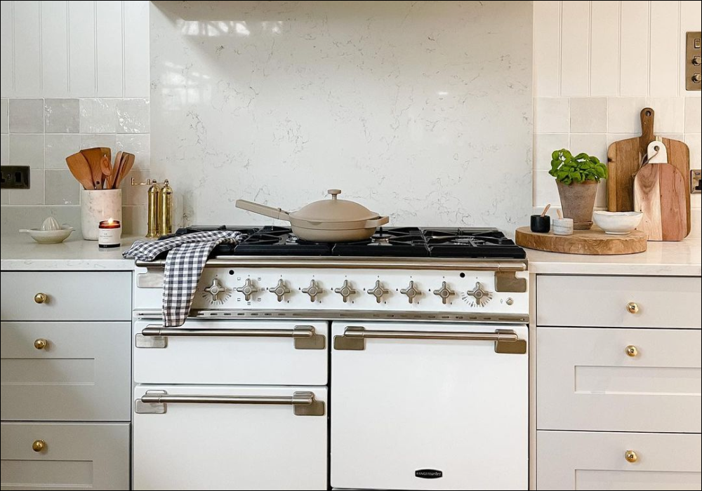
Stripped-Back Whites

Get that clean look by opting for a neutral like @mummydoesdiy has done with Pampas on your kitchen cabinet
White is the deceptively difficult choice. There’s so many options out there, and whites all have slightly different pigments which affect how they look quite dramatically. The key to painting kitchens white is to pick warmer tones. Try colours like Bookstore or Pampas which are clean because they’re a touch green, but also have a warmth which makes them feel welcoming. Using a white that is too clean can make your kitchen look like a surgery room, so when in doubt go for something with a touch of warmth. Pair these white kitchen cabinet paint colours with natural stones and brass ironmongery for an organic, traditional feel.
For those of you that do want a white that is super clean, use Low Salt. A slightly grey white that looks pristine because it doesn’t have any yellow in it, like most other whites out there. Creating monochromatic palettes with this white is easy, paired with grey veined marbles and black hardware for a simple, modern scheme.
Simple Greys

Grey kitchens have been in for a while, and don’t seem to be going anywhere. They’re a really safe choice because they work in almost any lighting condition and work with most interior trends. Warm greys like Margot are easy to live with. Because Margot has a touch of yellow, it keeps its inviting feel all day. If you’re looking for a slightly more dramatic grey, paint Big Timer on your kitchen cabinets and then paint your walls in a more calming grey tone like Sweatpants. This will keep the main space feeling bright and light, while providing some depth and interest.
Dark grey colours for kitchen cabinets have been in vogue for a minute, and a lead grey kitchen in The Coal Drop is a great way for producing a simple monochromatic grey scheme. Pair with a soft, slightly green grey like Rathbone Place on walls. Add beige toasters, kettles etc. and brass ironmongery for a modern take on a mid-century scheme.
Cool Blues
Blues is the world’s favourite colour for a reason. It’s effortless and calming, which is great for kitchens, especially in open plan spaces where we live out our everyday lives. Deep blues have been the go to kitchen cabinet paint colours for a while. These tones usually have a slightly grey tone to them, like The Establishment, which is a quintessential modern classic colour for kitchens, so give this a try if you’re looking to do something familiar and “Strong and Stable”.

Free Range is the ultimate calming colour. Try pairing it with Hamilton or Mr. Clifton on your walls for a perfect blue duo.
Another option for blue kitchens is to opt for something a touch warmer. Mr. Clifton is a deep blue that has a touch of yellow, making it warmer and more inviting than blues in most colour palettes. This unique colour works beautifully with brass or chrome fittings, and can be paired with either beige or grey neutrals for a colour scheme that can flex in the same way that interiors schemes tend to do.
For those of you that are looking for a coastal inspired kitchen scheme, or something a little less dark and moody look no further than Free Range. A duck egg blue that has a subtle grey undertones. This colour isn’t as dark as some of our other blues, but still sits well with more beige neutrals as well as grey tones.
Wondering what blue is right for your space? Check out our bestselling blue sample pack and test them all out...
Earthy Greens

Timeless greens like Darlington can give your cabinets a new lease of life in no time, take inspo from @ourlittlehome_2019 and grab a sample.
I think it’s safe to say that people have been a little bolder with their kitchen cabinet paint colours recently. Earthy greens have made a renaissance. Deep grey greens like Darlington; a traditionally Victorian colour, feel timeless when combined with more modern neutrals. Because Darlington is quite grey and also a touch yellow, it pairs well with any colour hardware, making it super versatile in most schemes for a touch of dramatic interest.
Nomad is a dark olive green and one of the best kitchen cabinet paint colours. It has a touch of warmth to it, so this deep botanical is a key player in biophilic design schemes. Combine Nomad kitchen cabinets with neutrals that have a touch of green to them, like Kind Regards or Tuesday’s Child. Satin Brass hardware tends to work best as a pairing, but can work with blacks and chromes too. Layer with wood and some delicate pattern too for a kitchen that feels welcoming and a touch theatrical.
Moody Blacks
Enter the little black kitchen cabinet. When you’re using really dark colours it’s better to keep them low down, so when using blacks only paint them on your lower kitchen cabinets or large pantry units. This helps these dramatic tones stay grounded. For the top units, keep those the same colour as the wall so that they disappear a little.
Dodie is a charcoal blue, not quite a black. This colour works well for kitchen cabinets as it’s a more relaxed version of a black and has a clean aesthetic. Dodie works well with grey tones like Margot and Sweatpants, but can also be at home with some of our warmer neutrals, like Safe Play.
As paint colours for kitchen cabinets go, black is a classic choice. The Record Store is a soft black. It doesn’t quite hold the drama of a jet black, but still produces an elegant silhouette. Blacks are super versatile in terms of hardware and wall colour pairings too. Blacks work particularly well in modern schemes with pop art accents and bright acidic colours. When combining black kitchen cabinets with neutral walls, make sure to go bold on artwork and accessories to bring your scheme to life.
Warming Yellows

Yellow is steadily becoming one of the more popular paint colours for kitchen cabinets. It has a warming quality, but remains bright in any lighting condition, making it a really stable choice for a kitchen. Yellow tends to work best on flat doored kitchen cabinets, creating a sleek, modern look. If the doors are yellow, using a black for the carcass and surround of your cabinet will help really make this bold colour choice pop. Combine blacks and yellows with vibrant artwork and subtle off-whites on walls, like Safe Play. For this colour combination use The Record Store and our prettiest yellow, Arctic Roll.
Using yellow on kitchens adds character. Going for bold, mustard paint colours for kitchen cabinets can help create a warming, golden glow in your space. This is particularly helpful for kitchens that are North facing that are usually quite dark and grey. Combine golden hues like House Points with fresher neutrals like Kind Regards for a timeless scheme that has a clean edge.
Potent Reds
Reds are a potent addition to a kitchen. They can be dramatic but when used in the right combinations can feel really elevated and classy. Use faded reds like Old Street in combination with taupes like Good Intentions and Sunday Soul for a warm and elegant kitchen scheme. When using deep tones like this, keep your dark colours lower and paint the kitchen units in the same colour as the wall.
Terracotta tones are bang on trend at the moment. Using these earthy colours, such as Baked, as the paint colour for your kitchen cabinets can help create a grounded feeling. These tend to work better with beige and pink tones, so slap some Pudding on the walls in our Soft Sheen finish for some extra durability. Use black or brass ironmongery for these warmer schemes, and then inject some fun with a Terrazzo worktop or tiling.
Old Corset Factory is a deep red that works particularly well in industrial interiors schemes. Paint this colour on your kitchen cabinets and compliment with black appliances and a bright taupe, like Mindful, on your walls. This will create an effortlessly elegant scheme.
Deep Darks

Deep darks have been on trend as kitchen cabinet paint colours for a while now. They provide depth and character to more neutral schemes. Dark blues and greens have become all the rage for kitchen cabinets for this reason. For deep marine tones, paint your kitchen cabinets in The Drink. This dark blue has a slight greeness to it, which makes it inviting and mysterious. Pair with brass hardware for a shot of warmth. Black accessories will also make your dark colours look a touch brighter. Use greyer neutrals in this scheme, like Sweatpants on walls to relax the rest of your kitchen space. For a greener version of this scheme, try Brewer cabinetry combined with Café Flore.

@huiswerk_styling pairs Adulting with Sunday Soul for a warm feeling that still looks sophisticated.
Some of the most complex colours make the best kitchen cabinet colours. Adulting is a dark, greyed teal. Because it’s equal parts blue, green and grey it maintains a warm feeling but feels sophisticated. Use this colour on bottom units and combine with upper cabinets in Hamilton for an easy and calming teal kitchen colour scheme. This scheme works with most worktops, including black and white quartz and marble and natural woods.
Two-Tone Approach
Contrast colour kitchen cabinets help to provide a feeling of grounding. The key to doing this is to paint any cabinets that touch the floor in a darker colour and the ones up top in something lighter. The most successful way to make 2 colour kitchen cabinets work is to use colours from the same colour family. So a lighter and darker shade of beige, grey or taupe for example. The great thing about this look is that it is easy to do with almost any colour, so make sure to use your favourite.

Beiges like Duvet Day on top cabinets and walls, with lower units in Moving Day are a great choice for a warming neutral scheme. Use the same colour on the wall as well as the upper units to help them blend into the wall and make your space feel a touch more open. Combine with deeper green or beige tiling and brass ironmongery for a natural looking beige scheme.
If you have corner cabinets in your kitchen, you can create a lowlight in the corner which will look relaxed and natural. Paint your corner units, and the walls above all in the same, slightly darker colour. These contrast colour kitchen cabinets and walls work well in deeper neutrals like Cold Brew, when combined with Sunday Soul. These grey taupes will create an earth palette that feels balanced and grounded.
Colour Pops
Colourful kitchen cabinets can be the pop of character that helps make a usually clinical room feel engaging and homely. Particularly useful as a backdrop in integrated fridges where you can put up the kids artwork, or as a singular door to add a burst of colour. Really bright colours embedded into neutral schemes work best for this. Try Sima, a saturated coral red or My Island, a tropical orange. Hot, vibrant tones like these will help create a fresh contrast to any neutrals you may have.

Earlier we spoke about how to create a deep but relaxed teal scheme with Adulting and Hamilton. But this could easily turn into a colour pop scheme but painting the inside of your cabinets with our most vibrant teal, The Four Poster. This saturated blue-green is eye catching, and when in a space that doesn’t have much light (like the inside of a cupboard), provides just a pop of excitement.
Painting your kitchen cabinets? Make sure to use our Eggshell finish. If you need more help, check out our How to Paint Kitchen Cabinets blog.
